


Pop-Up Precision
Guiding clarity in a non-traditional retail format
2019
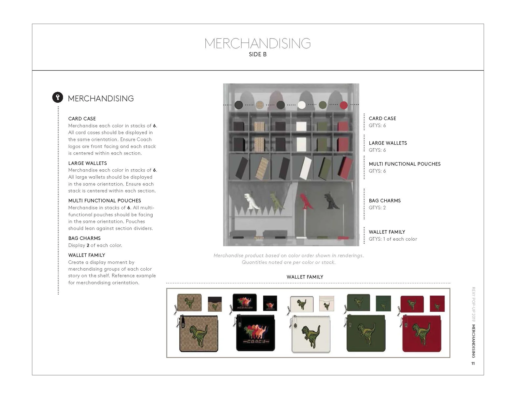
As design lead on this project at Coach, I developed a specialized version of the Global Visual Merchandising Guidelines, focused on a limited-run, bespoke pop-up experience. These materials guided local teams through the unique requirements of a high-touch, high-visibility space that sat outside traditional retail formats.
The Challenge
Unlike standard store rollouts, this pop-up required tailored visual direction to reflect its bespoke nature, while still aligning with Coach’s global standards. The challenge was to create a concise, visually compelling reference that communicated clear merchandising direction, even for a space that was different than the brand’s usual mold.
My Role & What I Created
As design lead, I:
Designed custom merchandising guideline pages specifically for the pop-up concept.
Collaborated closely with visual merchandising leads and store design to understand the spatial layout and product strategy.
Created layouts that included product placement visuals, mood direction, and elevated styling cues.
Balanced editorial polish with logistical clarity — so teams could not only understand the layout but execute it confidently.
Tools Used
Adobe InDesign (for layout design and formatting)
Adobe Illustrator and Photoshop (supporting graphics and asset prep, as needed)
The Outcome
The guidelines helped ensure the bespoke pop-up was merchandised to brand standards while delivering a more customized direction. The final deliverable was praised for being clear, beautifully branded, and easy to follow.
Design Note
This was a project that allowed me to combine creativity and precision. Designing for something as unique as a bespoke pop-up guideline pushed me to think beyond templates — and allowed me to flex both my editorial instincts and my love for structured systems. It was a small space with a big impact.